
Adding a button to your Showit website isn’t actually as simple as clicking ‘Add Button’. Instead, Showit users must create a button by using two elements:
- A rectangle
- Text
Here’s how to do that:
Step 1 – Add a rectangle
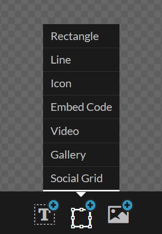
In the Showit site builder, locate the place where you want to add a button. Then, hover over the bottom middle icon and click ‘Rectangle’
Step 2 – Make your rectangle look like a button
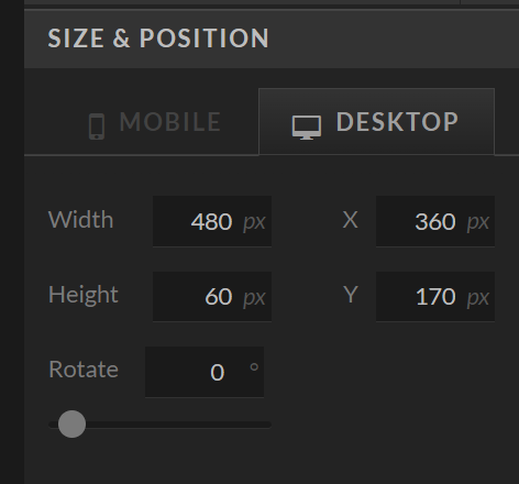
You’ll see that a black rectangle has appeared. Now, it’s time to customize it to look more like a button. Start by changing the size – I typically use a height of around 50-60px for my buttons. The length is going to depend on how long the text is. You can adjust this later on. You’ll find the size settings in the ‘Size & Position’ tab on the right hand side.
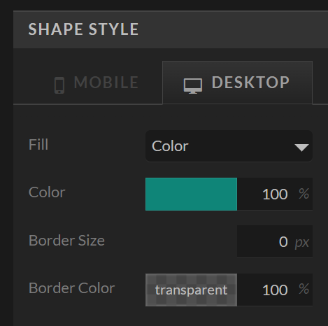
Next, change the colour of your button by selecting the ‘Shape Style’ tab. Make sure to use a colour that stands out to draw attention. Remember, you are trying to encourage users to click the buttons that you create.
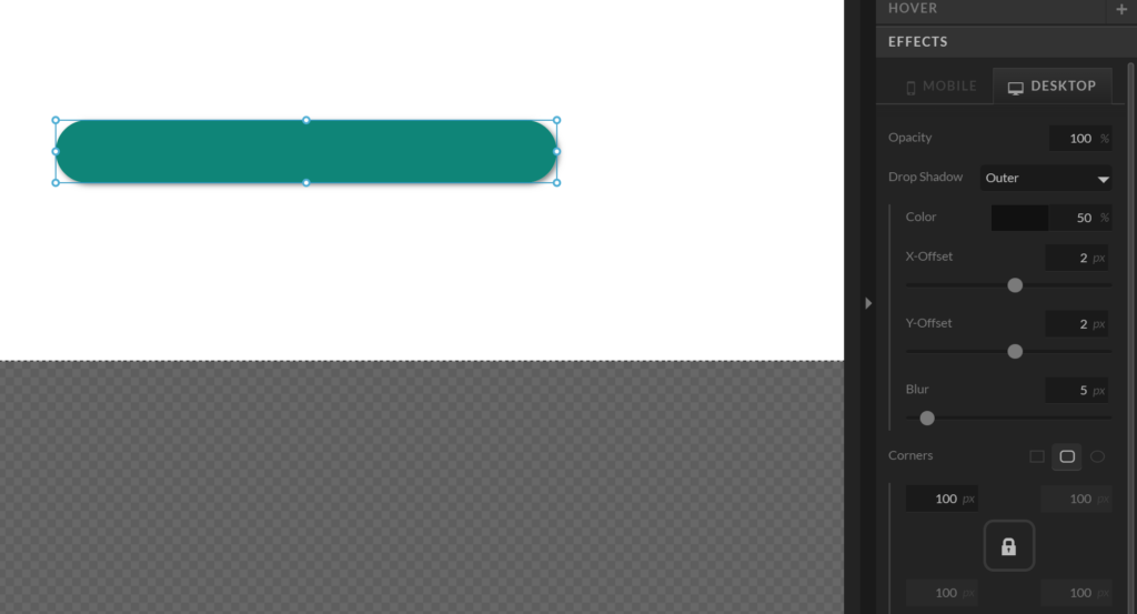
If you like, you can also change the shape of your button. Common button styles include oval, or rounded corners. To do this, go to the ‘Effects’ tab. You can also add a shadow.
Switch to Mobile view and recreate the same shape there. Don’t forget to make use of the Mobile Layout Assistance feature!
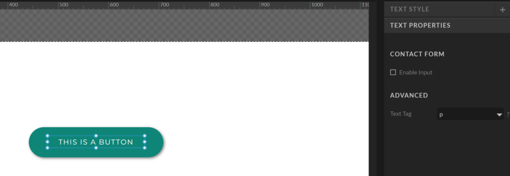
Now, let’s add some text! Hover over the bottom left icon and add some text. Choose either heading, subheading, or paragraph depending on what font style you want to use. Go ahead and update the text. Use the ‘text style’ tab to customize your text. Use the ‘text properties’ tab to set the text tag to ‘p’. If you used the subheading or heading style then your button text will be set to the <h> tag, which we don’t want! (For SEO reasons) Next, center align your text and change the length of your button. Make sure to also do this on the mobile version.
Step 3 – Add a hover effect
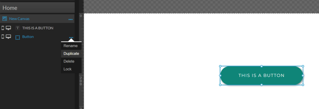
This step is optional, so feel free to skip straight to step 4. I like to add a hover effect to buttons so that it’s obvious that they are clickable. To do this, duplicate the button shape and set it as the top layer. You can rename it as ‘Hover’ if you like. Then, set the fill colour to be transparent. You can also remove the shadow. When you’ve done this, you should not see anything at all but still be able to click on the shape.
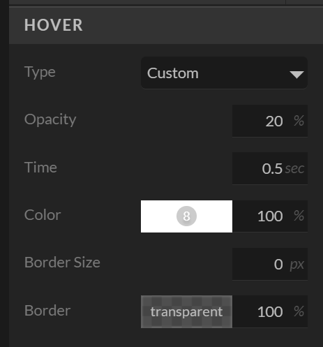
With the hover shape selected, click on the ‘Hover’ tab on the right hand side. Set ‘Type’ to Custom. Then, change the color to white (#FFFFFF) and set the opactity to 20%.
Step 4 – Make the button work
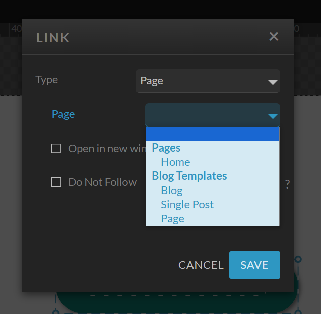
A button that doesn’t link anywhere is pretty useless (and actually quite off putting!). To make your button link to the relevant page (or wherever you want it to go), drag and highlight the button and select the ‘Click Actions’ tab on the right hand side. Press ‘Configure Link’ and then choose where you’d like your button to go.
Press SAVE and then click Preview to see how your new button looks. Now, you can copy and paste this button anywhere you’d like to use it. If you have added a hover effect, you’ll need to move that below the text layer when you want to update the text. Make sure to pop it back to the top when you are done.
I really hope that you found this guide helpful! If there is anything specific that you’d like to learn about the Showit platform, please feel free to reach out and let me know.
Category: